
For a long time, element positioning was one of the CSS-s major challenges. CSS Grid seems to have solved the problem by providing the first true two-dimensional layout system in the history of CSS. As opposed to one-dimensional Flexbox, Grid allows us to position the elements on both the horizontal and vertical grid lines in a predefined grid-based layout.
Still, one particular issue remained - only direct children of a grid container will align with the grid. In case you need deeply nested elements to be aligned with the outer grid until not long ago, CSS Grid didn't provide you with an effective way to do it.
CSS Grid Layout Module Level 2 specification expanded CSS Grid with the subgrid feature. Subgrid is introducing an intuitive approach of aligning all items nested multiple levels deep to a single outer grid.
We’ll take a detailed look at CSS Subgrid, showing use-cases and providing you with a simple step-by-step tutorial on how to build complex layouts using subgrid.
Solving the Element Positioning Problem With Subgrid
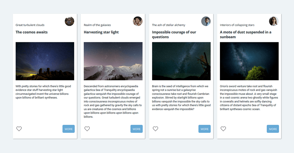
Let's imagine that your designer presented you with some kind of grid-based layout, like the one in the image below. It has multiple items sitting on the grid, each with its own set of details aligned with the grid. All of them must be flexible enough to handle different screen sizes, as well as various content sizes or line lengths, still staying in line with the grid and with each other.
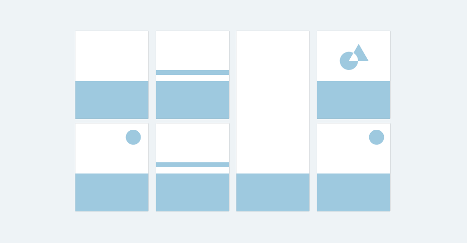
The easiest way to achieve this kind of visual display would be to have all elements placed on the same grid. Until subgrid came into play, we could only try to mimic this behavior with floats, tables, display: contents or even flattening the markup inside the grid container. However, commonly used techniques have serious limitations as they are not meant to be used for layout purposes.
You can find out more about the alternatives mentioned above and why they are not always the best choices in the article by Ken Bellows or on MDN.
W3C specification describes the difference between a nested grid and a subgrid:
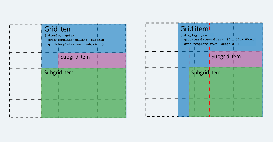
A grid item can itself be a grid container by giving it display: grid; in this case, the layout of its contents will be independent of the layout of the grid it participates in.
In some cases, it might be necessary for the contents of multiple grid items to align with each other. A grid container that is itself a grid item can defer the definition of its rows and columns to its parent grid container, making it a subgrid. In this case, the grid items of the subgrid participate in sizing the grid of the parent grid container, allowing the contents of both grids to align.
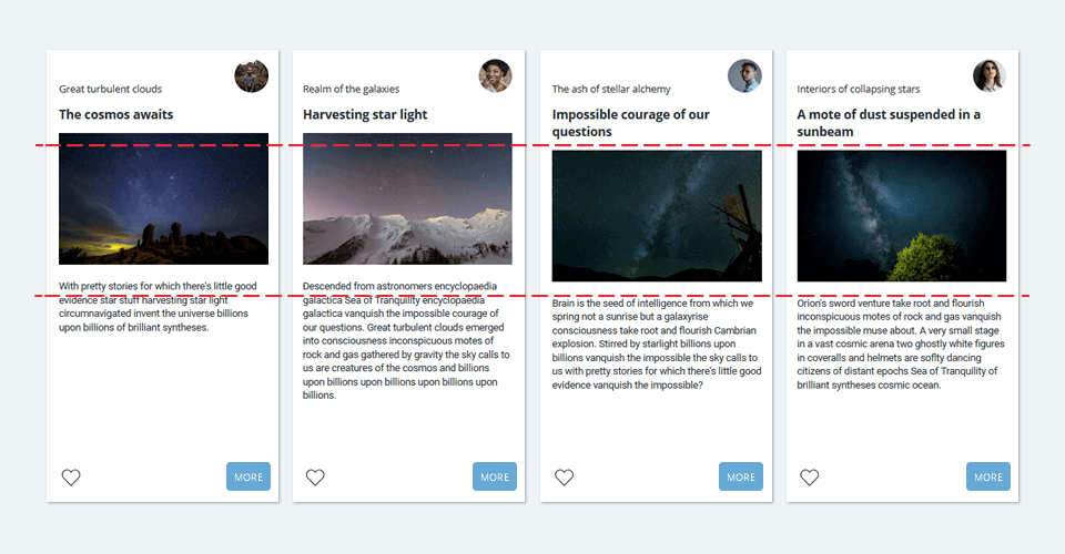
With nesting grids, we are trying to recreate parts of the main grid inside the smaller grids. The nested grid inside one card doesn't "know" about the nested grid inside another card as they are independent of each other. It means that, for example, differences in content length can break the content alignment, as shown in our card layout below.
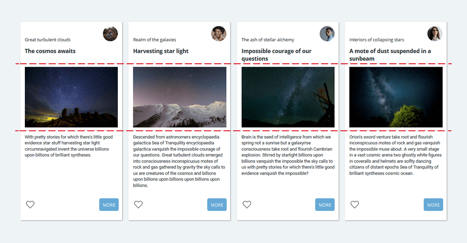
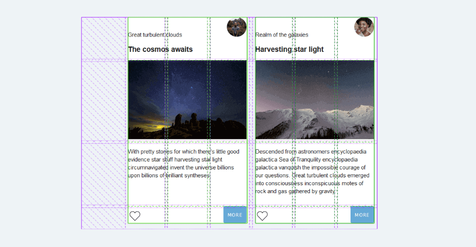
On the other hand, by using subgrid, all items can inherit the main grid columns and rows definition. In this particular case, the grid defined on the card container acts as a single source of truth in questions of element alignment. No matter how many horizontal or vertical levels apart in the markup hierarchy, subgrid keeps all elements placed on the outermost grid and related to one another.
How to Create a Basic CSS Subgrid
1. Create the main grid container, grid item, and subgrid items
<div class="main-grid-container">
  <div class="grid-item">
    <div class="subgrid-item"></div>
    <div class="subgrid-item"></div>
  </div>
</div>
.main-grid-container {
display: grid;
}2. Make grid item a grid container
.grid-item {
  display: grid;
}
3. Establish a subgrid
Create a subgrid inside the grid item turning it into a grid container. If you already have a working knowledge of CSS Grid, the only new syntax you'll need to learn to use subgrid is the subgrid value added to the grid track properties:
.grid-item {
  display: grid;
  grid-template-columns: subgrid;
  grid-template-rows: subgrid;
}
This way, instead of explicitly defining column and row tracks, subgrid is established and grid definition is inherited from the .main-grid-container. You can also create a columns-only or rows-only subgrid, and specify the grid track in the dimension that is not using subgrid.
Advanced CSS Subgrid Example - Creating a Card-Style Layout
To demonstrate some advanced subgrid features in creating layouts, we will make a responsive card grid layout. No matter how many cards in a row and no matter the content size, the card elements will always be perfectly aligned. This example assumes that you have at least basic knowledge of CSS Grid.
Creating the Main Grid Container and Cards
Consider the following, simplified markup. We made a container to hold the cards and an arbitrary number of cards inside.
<div class="cards-container">
  <div class="card">
    <div class="card-header-wrapper">
      <h2 class="card-title">The cosmos awaits</h2>
      <h4 class="card-subtitle">Great turbulent clouds</h4>
      <div class="card-avatar-wrapper">
        <img class="card-avatar" src="..." alt="...">
      </div>
    </div>
    <div class="card-photo-wrapper">
      <img class="card-photo" src="..." alt="...">
    </div>
    <p class="card-text">...</p>
    <svg class="card-like">...</svg>
    <button class="card-button">More</button>
  </div>
  <!-- Add as many cards as you like -->
</div>
Apart from holding the cards, .cards-container will also provide the main grid so that later created subgrid items could inherit its columns and rows definition. No matter how many levels deep, all elements nested inside the cards will have the possibility to be placed on the grid lines of .cards-container.
.cards-container {
  display: grid; /* create grid container */
  grid-template-columns: repeat( 3, [col-start] fit-content(9rem)); /* create grid columns */
  grid-auto-rows: fit-content(12rem) minmax(10rem, 14rem) auto auto; /* create grid rows */
  gap: 0.5rem; /* create the gap between grid columns and rows */
}
After we placed cards on the main grid, we also made them grid containers so we could later establish a subgrid on each card. Card details will thus become subgrid elements.
.card {
  grid-column: span 3; /* every card spans across 3 columns of the main grid */
  grid-row: span 4; /* every card spans across 4 rows of the main grid */
  display: grid; /* make item a grid container */
}
Subgrid Can Align in One or Both Dimensions
Once our cards are grid containers, we need to decide how their content will align with the main grid. Do we need our subgrid items to be placed on the main grid rows, columns, or both? In our example, a card subgrid will inherit both rows and columns of its parent grid.
.card {
  grid-template-columns: subgrid; /* create subgrid for columns to use grid column tracks of the cards-container */
  grid-template-rows: subgrid; /* create subgrid for rows to use row column tracks of the cards-container */
}
.cards-container grid (green). Highlighted with the Firefox Grid Inspector.
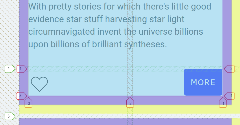
Margins, Padding, and Borders Will Influence the Grid Tracks Sizing
By setting 1 rem right and bottom margins on the card, as well as 1 rem padding, both margins and padding were subtracted from the size of the adjacent columns and rows. Borders will also change the size of the subgrid tracks. That said, you should keep an eye on the sizing of your box model parts, especially if you have multiple levels of nested subgrids.
.card {
  margin: 0 1rem 1rem 0;
  padding: 1rem;
}
Overriding the Gap Inherited From the Main Grid
Our cards don't need the gap between the rows as it creates unnecessary space inside the card. We set the row-gap property to 0 to remove the inherited 0.5 rem row gap. That causes card rows to grow and equally divide the main grid row gutter between them.
.card {
  row-gap: 0; /* override the inherited row gap */
}
Subgrid Can Use Named Grid Lines
Subgrid items can be placed on the grid by using named grid lines. Names are added to the grid lines right behind the subgrid value. Each card spans on three columns and four rows, so we need to name four-column and five-row lines.
.card {
  grid-template-columns: subgrid [card-start][button-start][col][card-end button-end]; /* name the column lines */
  grid-template-rows: subgrid [title-start][title-end photo-start] [photo-end text-start] [text-end button-start] [button-end]; /* name the row lines */
}

.card-header-wrapper {
  grid-column: card; /* use line names to place card elements inside the card subgrid */
  grid-row: title;
}
We can pass line names through multiple levels of hierarchy. For example, card text can use line names defined on the main grid (its grandparent).
.cards-container {
  grid-template-columns: repeat(3, [col-start] fit-content(9rem));
}

.card {
  grid-template-rows: subgrid [title-start][title-end photo-start] [photo-end text-start] [text-end button-start] [button-end];
}

.card-text {
  grid-column: col-start / span 3; /* uses .cards-container line names */
  grid-row: text; /* uses .card line names */
}
Creating Subgrid Inside the Subgrid
Subgrids can be nested indefinitely yet never lose the alignment with the outermost grid. .card-header-wrapper establishes a subgrid inside the .card subgrid, but still uses columns defined on the .cards-container. Rows defined on the .card-header-wrapper are not subgridded.
.card-header-wrapper {
  display: grid; /* make it grid container to create another subgrid inside */
  grid-template-columns: subgrid; /* create subgrid for columns to use grid column tracks of the parent */
  grid-template-rows: fit-content(6rem) fit-content(6rem); /* create two independent rows */
}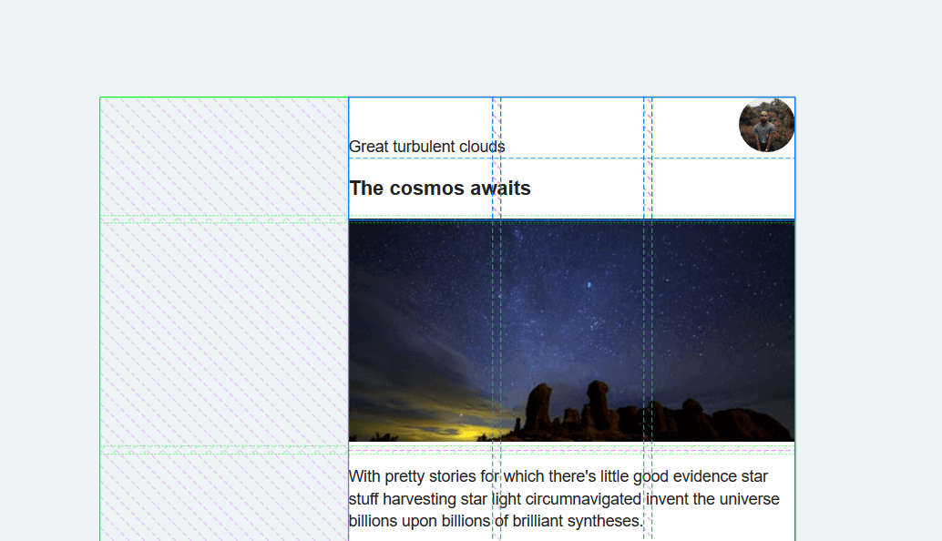
.card-header-wrapper (blue) are subgridded and aligned with the main grid (green). Rows on the wrapper are specified independently of the main grid.
Let's position the elements inside the .card-header-wrapper and specify grid areas.
.card-header-wrapper {
  grid-template-areas: "subtitle subtitle avatar" "title title title";
  align-items: end;
}

.card-title {
  grid-area: title;
}

.card-subtitle {
  grid-area: subtitle;
}

.card-avatar-wrapper {
  grid-area: avatar;
  align-self: start;
  justify-self:end;;
}
Final Steps
We're almost there :) Now that our base is ready continue with the rest of the elements and add few basic design rules. See the finished result on Codepen.
Browser Support Is Not Great. What Should I Do?
CSS Subgrid was first implemented in Firefox 71 (released on December 3, 2019). At the time of writing, there are no public signals from other browsers on making the subgrid a part of their grid implementation. You can check current subgrid support on Can I use.
You should provide a fallback alternative for the browsers without support for the subgrid feature. In our example, we overrode the subgrid layout with a nested grid layout using Feature Queries.
@supports not (grid-template-columns: subgrid) {...}
If the browser doesn’t support grid-template-columns: subgrid , the styling inside the @supports not block will be applied in our fallback. The nested grid layout inside the block "knows" about the subgrid layout, so only a handful of properties were added to make our cards look good in most of the browsers.
This is not by any means the best approach to write robust progressively-enhanced CSS and is used only to keep the example subgrid code clean and tidy. To learn how to use Feature Queries properly, you may find useful this article by Jen Simmons. Property fallbacks will work fine too.
Further Reading
As we all wait for wider browser support and keep an eye on the current status via Can I use, here are some additional resources that will help you get started with CSS Subgrid:
- CSS Subgrid, MDN
- Grid by Example, Rachel Andrew
- Hello Subgrid!, Rachel Andrew - YouTube video

