Dark mode has become one of the most often requested app and website design features. So, we've put together this implementation tutorial with examples. Explore prefers-color-scheme media query, how to make a mode switch with JavaScript, and what else to consider.
There are many potential benefits of dark mode, like saving battery life and reducing eye-strain in low light environments. For some users, dark mode is an accessibility feature helping with light-triggered migraine problems. Others prefer it simply for aesthetic reasons.
On most devices/operating systems, users can enable dark mode at a system level. This usually works system-wide, including default and third-party apps. But what about websites? Would it be possible to adapt to the user's preferred color scheme automatically?
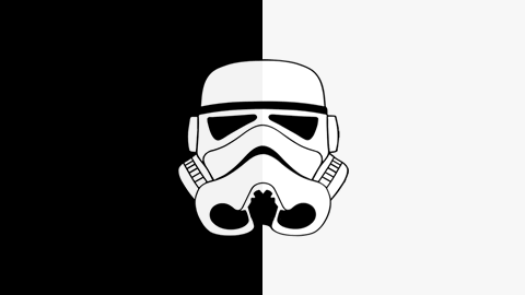
'Do. Or do not. There is no try.' - Yoda
Changing the color mode settings of the operating system switches the Death Star colors:
Example 1
User system mode detected:TIP: You can test emulating prefers-color-scheme with Chrome DevTools (Customize and control DevTools > More tools > Rendering > Emulate CSS media feature prefers-color-scheme).
The CSS prefers-color-scheme media query accomplishes an instant change in appearance. Now, let's see what exactly is prefers-color-scheme and how it behaves in action - we're also going to show in this tutorial how to detect and toggle between light and dark mode using JavaScript on your website.
What Is the prefers-color-scheme Media Query Anyway?
The prefers-colors-scheme media query gets applied depending on the user's color scheme preference in the OS. For example, if you selected dark mode in your OS settings, all websites with dark mode support will be displayed in your preferred mode, applying the CSS rules defined inside the prefers-color-scheme media query. It's a new, Level 5 Media Query and already has good browser support. Learn how to enable dark mode in your OS in this article.
There are two prefers-color-scheme values to choose from:
- light - the user has expressed preference for a page that has a light mode or has not expressed an active preference
- dark - the user has expressed preference for a page that has a dark mode
Let's say we want to enable our website to switch to dark mode for users with such preference:
/* default, light mode styling */
.element {
  background-color: #fff;
  color: #000;
}

/* if user switches the system settings to dark mode */
/* this media query will be applied */
@media (prefers-color-scheme: dark) {
  .element {
    background-color: #000;
    color: #fff;
  }
}Voila, we now have dark mode support.
How to Add User Choice Mode Switch With prefers-color-scheme and JavaScript
Users who have set their color preferences to the OS's dark mode may still want to see certain websites in light mode and the other way around. Let's try to toggle between the two with the help of prefers-color-scheme in our Lightsabers tutorial example:
'Not the brightest lightsaber in the galaxy' - Unknown
Example 2 - Toggle
User system mode detected:Setting Markup and Styles
The simplified markup:
<body>
  <div class="wrapper">
    <svg class="lightsaber first">...</svg>
    <svg class="lightsaber second">...</svg>
    <button class="btn">Toggle mode</button>
  </div>
</body>
Colors are the only thing that really matters to us in this example. You can see an excerpt of the styles applied below, this time using CSS variables:
/* default, light mode styles set with variables */
:root {
  --color-background: #f9f9f9;
  --color-default: #000;
  --color-accent-1: deepskyblue;
  --color-accent-2: violet;
}

body {
  background-color: var(--color-background);
}

/* Toggle button */
.btn {
  background-color: var(--color-background);
  border: var(--color-default) solid 3px;
  color: var(--color-default);
}

/* SVG lightsabers */
.first-blade {
  fill: var(--color-accent-1);
}

.second-blade {
  fill: var(--color-accent-2);
}

.handle {
  fill: var(--color-default);
}
Then we define .dark-mode class with dark mode styles. It will be toggled on button click or added automatically to apply alternative dark mode color values on the entire document.
/*dark-mode*/
.dark-mode .example-2 {
  --color-background: #000;
  --color-default: #f9f9f9;
  --color-accent-1: cyan;
  --color-accent-2: magenta;
}
Apply Dark Mode With prefers-color-scheme Using JavaScript
Now you would probably expect us to add @media (prefers-color-scheme: dark) in our stylesheet. But, we will take a different approach. One of the reasons for it is keeping our CSS as DRY as possible without adding another set of variables with the same color values. We are going to demonstrate how to use the prefers-color-scheme media query with JavaScript instead.
First, we select the toggle button.
const button = document.querySelector(".btn");
Then we create a MediaQueryList object. The useDark object will help us test the media query against the window and notify the listener when the media query state changes.
const useDark = window.matchMedia("(prefers-color-scheme: dark)");
The toggleDarkMode function takes Boolean as an argument. Depending on the argument value, it toggles the .dark-mode class on the document.documentElement (<html> element). This way, dark mode style is applied sitewide.
function toggleDarkMode(state) {
  document.documentElement.classList.toggle("dark-mode", state);
}
The useDark object has a matches property that checks the prefers-color-scheme state (dark mode being on or off in the system). useDark.matches returns a Boolean, which we will use as toggleDarkMode function input parameter for the initial mode setting since we have no prefers-color-scheme media query defined in CSS to handle that part.
If the user has dark mode enabled, useDark.matches will return true, and toggleDarkMode will add the .dark-mode class so that dark mode will be applied when you first open the website.
toggleDarkMode(useDark.matches);Next, we’re going to add listeners to listen for changes in the OS settings and users toggle choice.
MediaQueryList object has an addListener method available. Following that, we have set an event listener on the useDark object and toggleDarkMode will be used inside the listener function to change the mode whenever the OS settings are changed. For example, by removing the .dark-mode class if the user switches from dark to light mode at the operating system level.
The evt is the event object that also has a matches property, so we can directly access it and pass the returned Boolean value into the toggleDarkMode function.
// Listening for the changes in the OS settings and auto switching the mode
useDark.addListener((evt) => toggleDarkMode(evt.matches));
Similarly, an event listener is added to the toggle button. It’s going to toggle the mode independently from the OS settings and override them.
// Toggles the "dark-mode" class on click
button.addEventListener("click", () => {
  document.documentElement.classList.toggle("dark-mode");
});
And voila again. The Lightsabers example respects your saved system color preferences but still lets you change the mode.
- Full example code on CodePen ›
Addition: How to Make Persistent User Choice Mode with JavaScript using localStorage
We may want to provide users with the possibility to save the mode selection making their choice persistent. Regardless of the colors set in their system, the website interface can be updated on load with the mode preference stored in the localStorage.
The main difference between the code below and the code from the previous example is that the initial setting loads the mode based on the localStorage state, instead of based on the prefers-color-scheme value. Button click listener function toggles dark-mode in localStorage by calling the setDarkModeLocalStorage function.
let darkModeState = false;

const button = document.querySelector(".btn");

// MediaQueryList object
const useDark = window.matchMedia("(prefers-color-scheme: dark)");

// Toggles the "dark-mode" class
function toggleDarkMode(state) {
  document.documentElement.classList.toggle("dark-mode", state);
  darkModeState = state;
}

// Sets localStorage state
function setDarkModeLocalStorage(state) {
  localStorage.setItem("dark-mode", state);
}

// Initial setting
toggleDarkMode(localStorage.getItem("dark-mode") == "true");

// Listen for changes in the OS settings.
// Note: the arrow function shorthand works only in modern browsers,
// for older browsers define the function using the function keyword.
useDark.addListener((evt) => toggleDarkMode(evt.matches));

// Toggles the "dark-mode" class on click and sets localStorage state
button.addEventListener("click", () => {
  darkModeState = !darkModeState;

  toggleDarkMode(darkModeState);
  setDarkModeLocalStorage(darkModeState);
});
Now, it not only allows us to toggle the mode, it lets us save the mode. If we select dark mode with the toggle button and reload the page or close and reopen the browser window, our dark mode will persist (even with light mode activated in the operating system).
Previously, cookies were the only way to store the data between usage sessions. Unlike localStorage, which allows us to create and keep data on the client-side, cookies are sent on the server with every HTTP request and are handled server-side. That’s why localStorage is an obvious option to store user preferences if you run a static website.
TIP: When using dynamic websites with localStorage, you should keep in mind that a flash of the default color scheme is possible while the mode is being determined. For color scheme activation without flashing, you could fetch the mode preference from localStorage before the page renders, in the <head> element of the HTML document.
<head>
  <script>
    const colorScheme = localStorage.getItem("color-scheme") || "light-mode";
  </script>
</head>
Handling Images in Dark Mode
Some images are very bright and will pop out even more from the dark background. It defeats the purpose of dark mode, especially if the images are large.
Art direction is, among other methods, selective loading with an <picture> element whose media attribute allows us to load images depending on the media query state. This way, we can load a different image when in dark mode.
<picture>
  <source srcset="light-image.jpg" media="(prefers-color-scheme: light)" />
  <source srcset="dark-image.jpg" media="(prefers-color-scheme: dark)" />
  <img src="light-image.jpg" />
</picture>
This example code will load the light image if your preferences are set to light mode, or the dark image if your preferences are set to dark mode.
Another way to make images more supportive of dark mode is to add a filter:
@media (prefers-color-scheme: dark) {
  /* we are excluding SVG */
  img:not([src$=".svg"]) {
    filter: brightness(70%);
  }
}
The color-scheme
Including the color-scheme meta tag in the document tells the browser that the document supports light, dark, or both modes. This is necessary because some system UI elements, like form controls and scrollbars, don’t adjust well to dark mode.
The following meta tag should be added to your document's head, with the value of the content attribute set to themes supported in the document:
<meta name="color-scheme" content="light dark" />
Alternatively, color-scheme can be added as a CSS property on any element in the stylesheet.
color-scheme: light dark;Read more about color-scheme on web.dev.
Bonus Dark Mode Example
In the example below, emulating a simple website landing page, dark mode is enabled with prefers-color-scheme media query in JavaScript and can be overridden with a mode switch.
Example 3
User system mode detected:- Full example code on GitHub ›
'Chewie, we’re home.' - Han Solo
We hope we've provided some insights about prefers-color-mode media query, dark mode and toggle implementation technique, as well as other things to consider when adding dark mode to your website. Here’s a further reading list on the topic of prefers-color-scheme and dark mode:
- prefers-color-scheme, MDN
- Dark UIs. The Good and the Bad. Dos and Don’ts, Miklos Philips, Toptal
