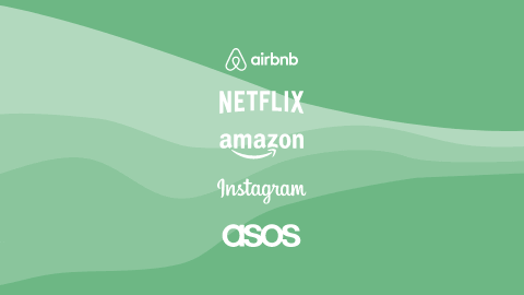
What do big brands like Netflix, Instagram, and ASOS have in common? Besides being on top of the ladder? The answer is exceptional conversion rates! Those insane numbers are making them the most influential brands of our time. Conversions are a crucial metric for any brand to be successful. Therefore, to get anywhere near their numbers, here are some strategies these giants and many others follow.
What Exactly Is a Conversion Rate?
Conversion is an action taken by your customers. It can be as sizeable as a purchase, also known as a macro conversion, or as small as signing up for a newsletter, a micro conversion.
For Facebook, the foremost conversion is still - creating an account, because when a macro conversion is the end goal, a micro one is a necessary step. For example, a user signs up for a free trial and later decides to proceed with a subscription.
Conversion rate is a ratio between active and passive users. Every business strives for a high conversion rate, and yet, in reality, good ones are about 2% - 5%. The very best brands usually have a rate of 30%, except for Netflix and Amazon Prime at an astounding 93% and 73% respectively.
So how do big brands encourage users to take action? We compiled nine simple steps that you can follow to improve your conversion rates:
1. Tell Your Story the Right Way
Take Nike as a perfect example - as simple as three words and a checkmark tell a story. Great design tells a great story by evoking emotion without being too literal or descriptive. Think about Nike's slogan: Just do it. How does it make you feel? Encouraged, dedicated, reassured, at ease may come to mind.
Another example is Lemonade Home Insurance. Using visual cues and illustrations, they reel users in and make them feel safe. Reviews and testimonials just below the fold make them seem trustworthy.
Convey emotions through design. Emotion is an integral part of the overall impression. When users experience emotions, they connect with the brand. Those connections lead to better conversion rates.
2. Create a Positive First Impression
When it comes to your service-providing app or website, content you place "above the fold" is going to matter the most for a positive first impression. Here is your foremost chance to grab attention and gain a customer! Airbnb's "above the fold" is a superb example of simplicity in service of catering to users' needs.
Using your website's analytics lets you discover the most commonly used devices for your service and determine where the "fold" is. Place your primary content for the first impression above. Use color, text, and form elements sensibly in your design. Be aware of the meaning of those elements; some vary from one culture to another, and some have universal meaning.
3. Navigate Towards the Conversion
One of the ways to help users navigate through your content is appropriately organizing and emphasizing CTAs - calls to action. There are essential elements to help highlight the CTAs; such as color, size, and placement. Another prominent element is the content writing or copy in short. Copy should be distinct and very concise.
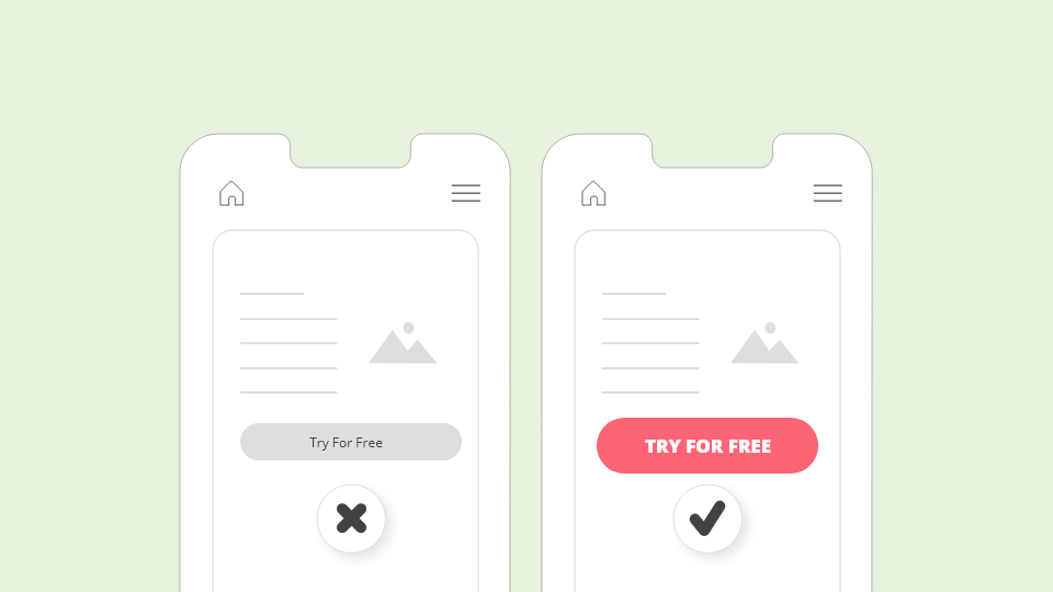
ASOS, one of the leading online fashion stores, boldly puts spotlights on discount CTAs, without any hesitation. They are eye-catching, in vivid colors, above the fold, and easy to read. One of the greatest, Amazon, hit a bullseye with their "Buy Now with 1-Click" phenomenon.
Think about where and how to place your CTAs. To ensure the best results, conduct A/B tests to see what works best. The user interface should be easy to understand and navigate. Apart from CTAs, standardized UI elements contribute to smooth user flow.
4. Provide a Preview of Your Content
Two efficient methods of previews are a freemium model and a free trial. Both have a goal to lure real users in. Freemium offers limited access to content; to access everything, users must pay. The free trial gives access to all content for a limited time. Streaming services like Spotify, Netflix, and many other big brands use these methods.
5. Simplify Users' Decision-Making Process
In decision-making, Hick's law can be applied. More choice and more time to make a decision - consequently a bigger chance of quitting. Giving users too many options can confuse them.
Apart from the amount of choice, another factor influencing decision-making is web speed: faster websites result in better user experience and, therefore, a bigger chance of conversions.
Like ASOS, be sure to give all the information necessary, such as exact product information, promo codes, and how to get them beforehand. That way, users don't have to prolong making up their minds once they're almost at the checkout.
6. Appreciation After the Conversion
Once the action gets finalized, don't forget an incentive - a "thank you" for completing a task. You want users to know they're appreciated. Incentives can be promo codes or access to exclusive content.
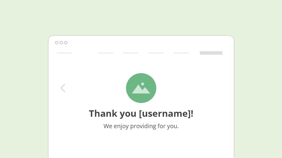
Ritual, a food ordering app, allows users to collect points by placing orders. They promote continued use by empowering users to earn more points if they order again. Sometimes, just a simple pop-up screen of congratulations may feel rewarding enough.
7. Keep Users Engaged
Keep the engagement going. Occasionally, Netflix will send you a mail recommending a movie for you or telling you your favorite show has new episodes. It lets users know they care and helps build a connection. Also, they will check in on users towards the end of the trial or subscription to see if they'd like to continue.
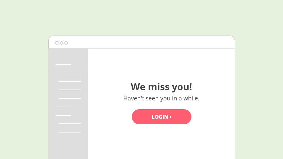
Duolingo has a similar strategy of sending mail when users haven't used the app for a while, an excellent example of building trust with customers. Another great engagement would be to ask for their opinion: Perhaps there is something you wish for us to improve?
8. Include All Users
Designing with accessibility in mind is becoming a norm and has many benefits. One of them is reaching out to a broad audience with everyone equally understanding your content and nobody feeling left out. Follow design standards recommended by the Web Content Accessibility Guidelines (WCAG). Recognize the fact that some users are people with disabilities. Web content needs to be accessible to everyone.
To put inclusive design into practice, think of the assistive technology that people with disabilities might use, like screen readers or switch controls. Designing with that in mind can bring you one step further in solving users' problems.
Simple considerations go a long way. For your content to be more inclusive, create strong contrasts to make text and form more legible. Here is everything you need to know about accessibility.
9. Be Careful With Pop-Ups
When creating a path to conversion, keep distractions and intrusive pop-ups out of the way. Pop-ups are one of many ways to encourage conversion, but they can be a distraction when overused. They might seem like a great idea, but you should consider where, when, and why you use them.
Last, but Not Least, Check the Data!
These nine actionable steps big brands apply for better conversions can help you enhance the customer experience, which will lead to a boost in your conversion rates. The conversion game is all about connecting the brand with the user. You can't make real improvements without understanding the user's behavior. Tracking and analyzing data then optimizing and updating your content is pivotal.
Google's Core Web Vitals is a great set of user experience metrics that will introduce you to various factors that impact the quality of your online service. Learn more about the importance of CWV.
In order to keep track of your data, there are a lot of automated tools and services. On the other hand, human testing brings valuable results as well. Sometimes a redesign is not necessary, but a few meaningful changes can improve your conversion rates. (Human) UX audit helps you target core issues so you can make those crucial changes. Another good tip is always to check what the big brands are doing.