Logo design is a trademark of everything that a company and its products or services are representing. In today's world, the logo, as a part of a company's visual identity, is used in almost all spheres of human activities. The world around us is full of logos that we unmistakably associate with a brand or organization. How did their visual identity become part of our daily lives and way of life? How did they succeed and how to design an excellent logo?
For a good and striking logo, a complex combination of design knowledge is needed: creative theory and experience in application. If you want the best to create your logo, it would be advisable to hire graphic design professionals. The Cost and quality of development vary. You should inquire about companies and individuals who already have a positive experience in branding and design.
Even though most designers will know how to create a logo, only the most experienced ones will know how to express a client's entire story with a trademark or symbol that will attract the attention and trust of all who encounter it. Keep in mind that this logo, as an official trademark of your company, will be on a memorandum, stamp, business card, letterhead, website, and all your promotional material.
From inspiration to designing a logo
It all starts with an idea. If you started your business on your one, try to remember all the positive feelings and ideas you had. The hardest part of the job is to express the vision and the feeling with pen and paper. Well thought out ligation - merging two letters into one so that at least one of them has a different shape (eg æ for ae) or the imaginative use of letters can be a great start. Likewise, the clever use of specific colors, grading or redistribution of letters, and even subtraction of a piece of the whole can be the decisive part that makes the difference between the bad and the ingenious solution. You should also pay attention to the ratios between all the elements inside the logo so that it can be applied in all dimensions.
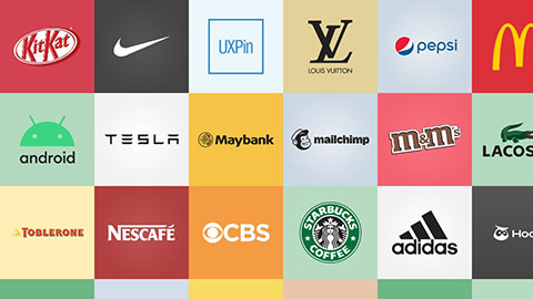
The making of a logo can be easily split into three basic ways. The first is based on typography, such as IBM or Sony. The second are logos that almost literally outline what the company's business is. The last are the logos that are reduced to an abstract symbol and among the most famous is Nike's checkmark. The third, abstract, logo is not for companies that are just starting their market breakthrough because it is almost impossible to be recognizable in this way without many years of market establishing, marketing experience, and building customer and partner trust.
Study your competition and how they communicate through their logo. Do not imitate others. It is challenging to do something unique and new but well worth it. Also, consider what your target audience is and focus on the message you want to convey. Styles change on a daily basis, so inform yourself and follow the latest trends for inspiration but do not blindly follow them. An excellent logo design retains its quality over time.
Some of the best logos give a direct message by illustration, not words. For example, if you are selling bakery products, bread illustrations or recognizable bread rolls will clearly describe your business. In the example of the bakery we have mentioned, it will surely not be okay to copy the design of a bakery chain that is currently very popular, hoping that you will use this process to snatch a piece of their pie. Additionally, if most of your competitors use a similar logo to illustrate bread, as in this example, avoid being a part of the majority and try something different, but do not forget to make it as clear and recognizable as possible in describing what you do and offer.
The colors transmit the message
The logo must be functional because you want it to look just as well printed on a memo, on a web page, in various promotional materials or, for example, on a big truck trailer. When choosing colors, be very careful. Try to limit your colors to three.
There are numerous researches on the subject of color impacts on our psychology. These are some of the guidelines you can use when choosing a color for your logo:
- Red: energy, sex appeal, courage
- Orange: creativity, friendship, youth
- Yellow: Sunshine, inventiveness, optimism
- Green: growth, organic, educational
- Blue: professionalism, medicine, relaxation, reliability
- Purple: spirituality, wisdom, challenge
- Black: confidence and strength
- White: simplicity, ease, the essence
- Pink: fun and seductive
- Brown: rurality, history, permanence
Application and Consistency
After creating a logo and a visual identity, you must stand by it and apply it correctly. The book of standards helps to determine the parameters of the logo and symbols, their proportions, color, interrelationships, typography, and correct and incorrect use. Especially in larger companies, the book of standards is an essential tool for your internal and external communication to be consistent and in accordance with your visual identity.